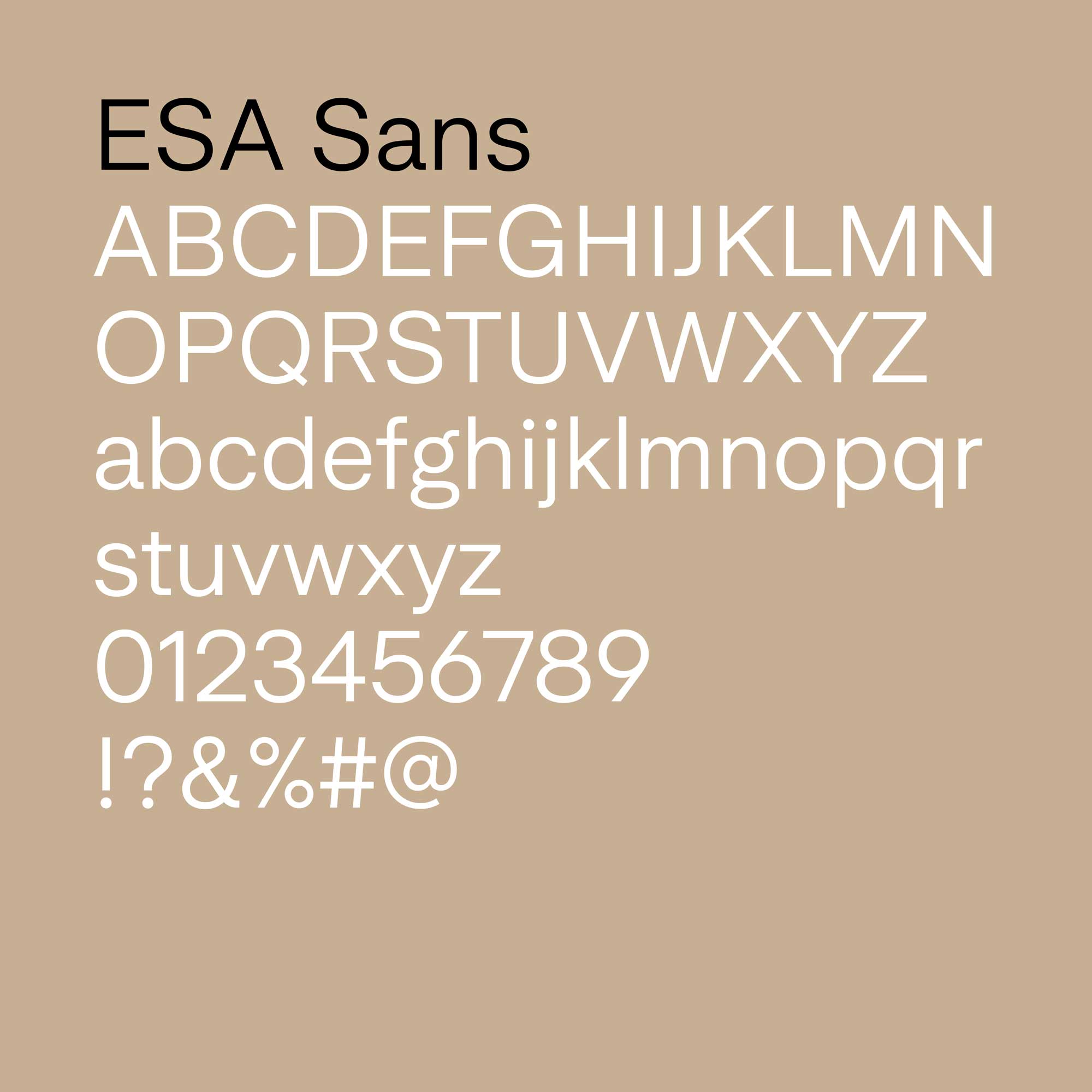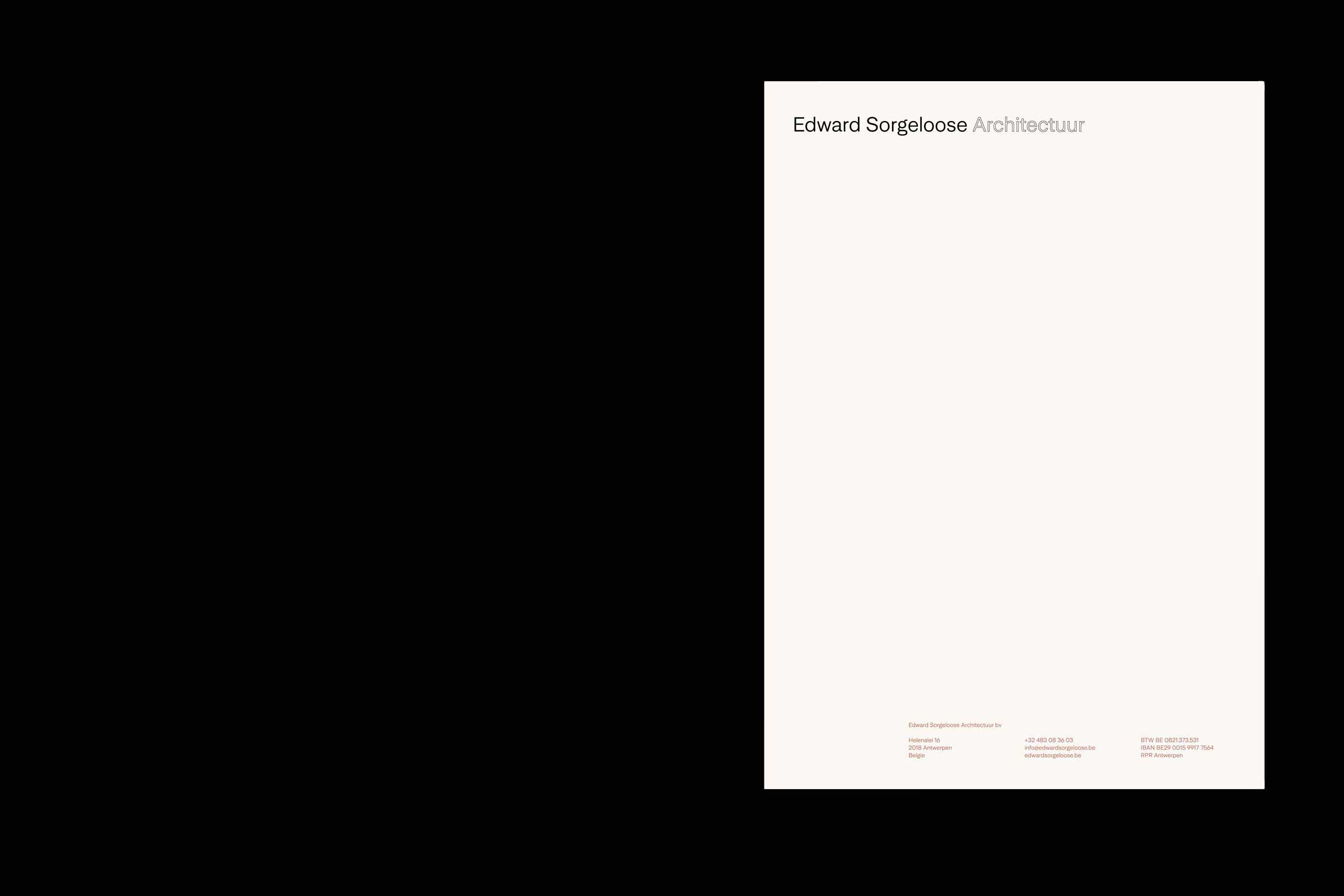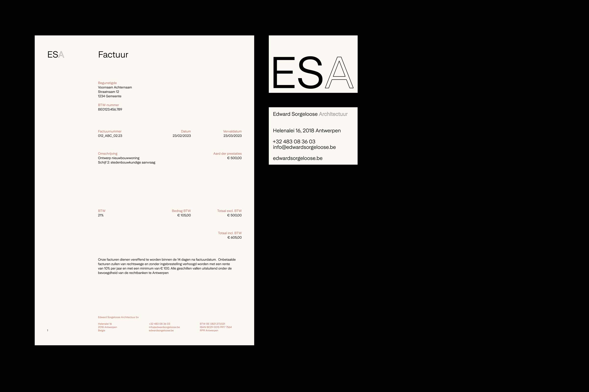
For the Antwerp-based firm Edward Sorgeloose Architectuur (ESA), we developed a comprehensive brand identity that embodies the company’s values and aligns seamlessly with their architectural projects. This identity features a custom cut of Universal Sans by Family Type, with meticulously crafted letterforms that reflect ESA’s clear architectural language and their extensive expertise in projects ranging from interior design and architecture to masterplanning.
The color palette is inspired by the natural hues and materials found in their built work, reinforcing a connection to the environments they create. The brand identity extends to environmental graphics, incorporating window decals, signage, and banners, which together provide the firm with a bold and cohesive presence in the streetscape, visible and impactful from both near and far.
This cohesive identity is implemented across a variety of media. It enhances their online presence through a well-designed website and supports their offline communication with print collateral, including letterhead, document templates, and business cards. Every element of the brand identity has been thoughtfully designed to ensure consistency and to effectively communicate the firm’s dedication to quality and innovation in architecture.